Progressively Enhanced Form Validation
In this post, we'll examine an approach to progressively enhance your HTML5 form validation in your Vue.js application, using existing DOM API's and minimal overhead to your existing Vue components.
Note: This is based on the Lightning Talk I gave at VueConf 2019, so if you're more into videos instead of posts - feel free to check that out instead!
Wait, doesn't HTML5 do validation for us?
Yes! But only if you don't care too much about how it looks to the user. Let's look at a simple a simple validation example in CodePen, generated from the following markup:
<form onsubmit="return false;">
  <input name="Name" placeholder="Name" required /><br>
  <button>Submit</button>
</form>
See the Pen HTML5 Form Validation by Matt Brophy (@brophdawg11) on CodePen.
Go ahead and click Submit without entering a name, and depending on which browser you are using, you'll get something like one of the following displays (Chrome, Firefox, and Safari, respectively):
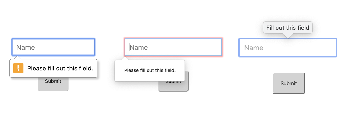
As far as I know, there's no way to currently change the display of those error bubbles, and I've yet to work with a design team that would be OK with such a delta across browser for their users. In doing some searching, I did find this really neat demo from Chris Coyier that shows just how much we can do with mostly HTML/CSS - but it's still a far cry short of what we can do with the form validation libraries we've gotten used to.
Requirements
So, when we first started evaluating Vue form validation libraries at URBN back in late 2018, we had a few criteria that we wanted to meet.
It should be small - we're using performance budgets and keeping a close eye on all dependencies we pull in. We shouldn't end up pulling in a large dependency just to do form validation.
It should build on top of HTML5 validation attributes - our devs already know these HTML5 attributes. Why make them learn another meta-language? Plus, why would we bother shipping new validation logic that the browser should already know how to do?
It should be non-intrusive to v-model - similar to above - our devs already know how to use v-model, so that usage shouldn't change based on whether the given input is validated or not.
Existing Libraries
We initially looked at the two main Vue form validation libraries - Vee-Validate and Vuelidate.
vee-validate
The thing we liked about vee-validate was it's template driven approach. However, it was still going through a custom v-validate directive which cluttered up the actual input elements. You also specified your validation rules through this directive instead of using existing HTML5 validation attributes. Finally, at the time v2 was prohibitively large (30k gzipped). So in the end, it didn't meet a few of our requirements.
It does look like they've made some major changes in v3 - moving to a wrapper component (ValidationProvider) which is very similar to what we'll be discussing in this blog post, and they've made huge jumps in bundle size, cutting it down to 8.6k gzipped. That alone make vee-validate something I would reconsider on a future project. It still as of this writing doesn't appear to use existing validation attributes and instead asks you to pass them through the wrapper component:
<ValidationProvider name="email" rules="required|email" v-slot="{ errors }">
  <input v-model="email" type="text">
  <span>{{ errors[0] }}</span>
</ValidationProvider>
vuelidate
Vuelidate was much more reasonable in size, only 3.5k gzipped, but it had a fairly awkward model-driven approach that was intrusive to v-model, required defining validations in javascript instead of the template, and didn't use any existing HTML5 validation attributes.
Hello ValidityState
At this point, we started doing some investigations into form validation at the browser level, and discovered the ValidityState API. This was pretty eye-opening to me - in that this had been around since Internet Explorer 10, but I had never even heard of it! I'd been so used to just reaching for a form validation library out of the box in Angular, Backbone, etc. that I had never looked hard enough to discover ValidityState.
Here's a quick example of the ValidityState object for the following input when it is left blank:
<input required minlength="5" />
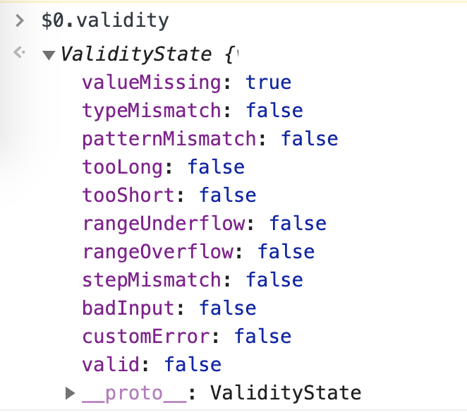
As you can see it is reported as valueMissing: true which is because it is a required input and we have not yet provided a value. It also is marked as valid: false which indicates that at least one of it's validations has failed. If we enter a 2-character string in there, then valueMissing would flip to false and tooShort would flip to true because we are not meeting the minimum length requirement.
This really got me thinking that it would be possible to write a very small form validation approach building on top of what the browser already gave us.
The birth of WithValidation
Going back to our original design goals, we wanted to leave inputs as untouched as possible, regardless of if they were validated. Ideally, this would include transparent wrapper components or other components exposing v-model as much as possible.
So, consider the following input:
<!-- Plain HTML5 -->
<input v-model="firstName" name="firstName" required />

<!-- Or using a transparent wrapper -->
<BaseInput v-model="firstName" name="firstName" required />
We wanted to have a way to incorporate the underlying ValidityState api into our Vue landscape without having to modify the component. A directive could probably do the trick, but we had already seen that we didn't like what that looked like through vee-validate. So the next thing that seemed to make sense was a wrapper component with a slot for the input:
<WithValidation>
    <input v-model="firstName" name="firstName" required />
</WithValidation>
If we could go that route, then we need to figure out how to do the following 3 things:
- Gain access to the input DOM element
- Send it's
el.validityobject upwards via an event - Do this each time the input value changes
Access the input DOM element
Since this new component doesn't actually have to render any markup of it's own to the DOM, we can make it a renderless component, and simply render it's passed slot. Then, because our slot will have the input as the first and only element, in this contrived example the input element will be this.$el.
Vue.component('WithValidation', {
    render() {
        return this.$slots.default[0];
    },
});
Send the validity object upwards
In order to send the information upwards, we can emit an event with the ValidityState object of our input:
Vue.component('WithValidation', {
    methods: {
        emitValidity() {
            if (!this.$el || !this.$el.validity) return;
            this.$emit('update', this.$el.validity);
        },
    },
    render() {
        return this.$slots.default[0];
    },
});
Do this each time the component changes
Finally, we want to do this each time the input changes. Thankfully, for us, any change to the input will cause a re-render our renderless component, so we canm just hook into the component updated hook which should run every time the input changes:
Vue.component('WithValidation', {
    updated() {
        this.emitValidity();
    },
    methods: {
        emitValidity() {
            if (!this.$el || !this.$el.validity) return;
            this.$emit('validity', this.$el.validity);
        },
    },
    render() {
        return this.$slots.default[0];
    },
});
...and that's it! For this simple example, it took only 14 lines of code to provide real time validation information into our Vue components. With just a tiny bit more code, we can add a listener for our validity even and provide some real-time error messaging to the user based on user updates.
See the Pen Vue Progressively Enhanced Form Validation by Matt Brophy (@brophdawg11) on CodePen.
What's Next?
Now that we have this baseline in place, there's a lot more that could be done to expand the validation logic. Here's just a quick list of things we might be able to, or want to do:
I want to nest my input element deeper in the slot
Sure thing! We could walk the DOM tree downward in mounted and find the first input, textarea, or select element and store a reference to it
I don't like the ValidityState naming (i.e., valueMissing, tooShort, etc.)
Me either! Why not map them to familiar attribute names in emitValidity?
methods: {
    emitValidity() {
        if (!this.$el || !this.$el.validity) return;
        this.$emit('errors', {
            required: this.$el.validity.valueMissing,
            minlength: this.$el.validity.tooShort,
            ...
        });
    },
},
I don't want to display errors until after the user has left into the field
No problem! We could add a touched field to the data we emit upwards, and use a one-time blur even listener to toggle that to true the first time it fires. Then we could use that in our parent component to only showw errors on touched fields.
I need to do custom validations
OK! So long as we know the input, we know the input value via el.value. Therefore, we should be able to add our own custom validations. We could pass them in via a prop and add support for checking them in emitValidity. For example:
// Assume the incoming customValidations prop is:
// {
//    phoneNumber: v => /\d{3}-\d{3}-\d{4}/.test(v)
// }

// WithValidation.vue
methods: {
    emitValidity() {
        if (!this.$el || !this.$el.validity) return;
        this.$emit('errors', {
            required: this.$el.validity.valueMissing,
            minlength: this.$el.validity.tooShort,
            // Loop through all custom validations and include them as keys
            // on the new errors object
            ...Object.entries(this.customValidations || {}).reduce((acc, e) => {
                [e[0]]: e[1](this.$el.value) !== true,
            }, {}),
        });
    },
},
What about displaying my input label and errors?
Those are important! While you could just render them manually, this sounds like a potential use case for another higher order component that handles placing a label before the input and a list of errors afterwards, and proxying the slot to a nested WithValidation component. Maybe I'll do another blog post on this - something like:
<!-- You write the following -->
<InputEnhancer label="First Name">
    <input v-model="firstName" id="firstName" name="firstName" required minlength="5" />
</InputEnhancer>

<!-- Which results in: -->
<label for="firstName">First Name</label>
<input v-model="firstName" id="firstName" name="firstName" required minlength="5" />
<ul class="errors">
    <!-- Errors are hidden/shown automatically via CSS -->
    <li>This field is required</li>
    <li>This field is too short</li>
</ul>
Does this work in SSR?
Somewhat. We're currently using it that way at URBN, but it's not without it's complexities. During SSR, you don't have access to the DOM so we can't just walk a DOM tree to find the input. We do have a vnode tree - but it also has some nuances with functional and renderless components that we've had to work around. The more we find these complexities, the more I'm starting to lean towards validation being something you only worry about on the client, because it gets vastly simpler that way. Just let the browser fall back to HTML5 validation if JS is disabled, and don't try to do any complex DOM tree analysis during SSR.
Conclusion
Form validation is more and more important in the complex web applications we build these days. But developers want to to be easy so they often reach for a big third party library that likely does far more validation capabilities than they actually need. I hope this article has demonstrated that without too much custom code, we can leverage the powerful validation APIs built right into the browser.
We'd like to eventually open source some or all of our validation components at URBN, but they're way too tightly coupled to our use-cases at the moment (and our sUI needs) so we haven't yet found the time to look into decoupling those.
Thanks for reading!